During my last two years of high school I worked at my local volunteer rescue squad running calls alongside the other EMTs. While maybe not a conventional path into user experience design, it taught me to take an empathetic approach to both my work and daily life. I have always been interested in med-tech and one of my many interests is to explore ways to create more intuitive and user centered medical devices and applications through my knowledge in UX.
As a combination of my interests in medicine and human computer interaction, I accepted an internship offer at a high growth lab-tech company Aegis Sciences. While I worked on a variety of products and projects some of which I can’t talk about due to NDA, one particular project I worked on was a side project my mentor and I explored during the summer.
Midway through the summer, we noticed that a weekly analytics task, creating dashboards to present preformance metrics, was horribly inefficient. While many detailed modeling applications exist such as Tableau, they needed a custom, quick, and simple sytem for creating preset dashboards.
A newcomer to Aegis's analytics division, one of her tasks is to create the weekly corporate dashboard using Excel. She has a busy schedule and needs to find time to create, send, and print the dashboards every week. I worked extensively with her to determine the requirements for my design.
Problem: Too many formatting errors when printing through Excel.
Problem: Updating metric data is time consuming and confusing as she needs to look through multiple pages of an excel spreadsheet.
Problem: Data is scattered and unclear which chart its mapped too.
1. Efficiency: We need to allow Kenya to update the charts quickly with minimal errors.
2. Clarity: Kenya was having trouble finding which chart each data set was mapped to. We need to find her a way to easily see which chart she is editing.
3. Exports: A major issue she encounters is inconsitent formatting when printing her dashboards; lets make exporting easy and robust.
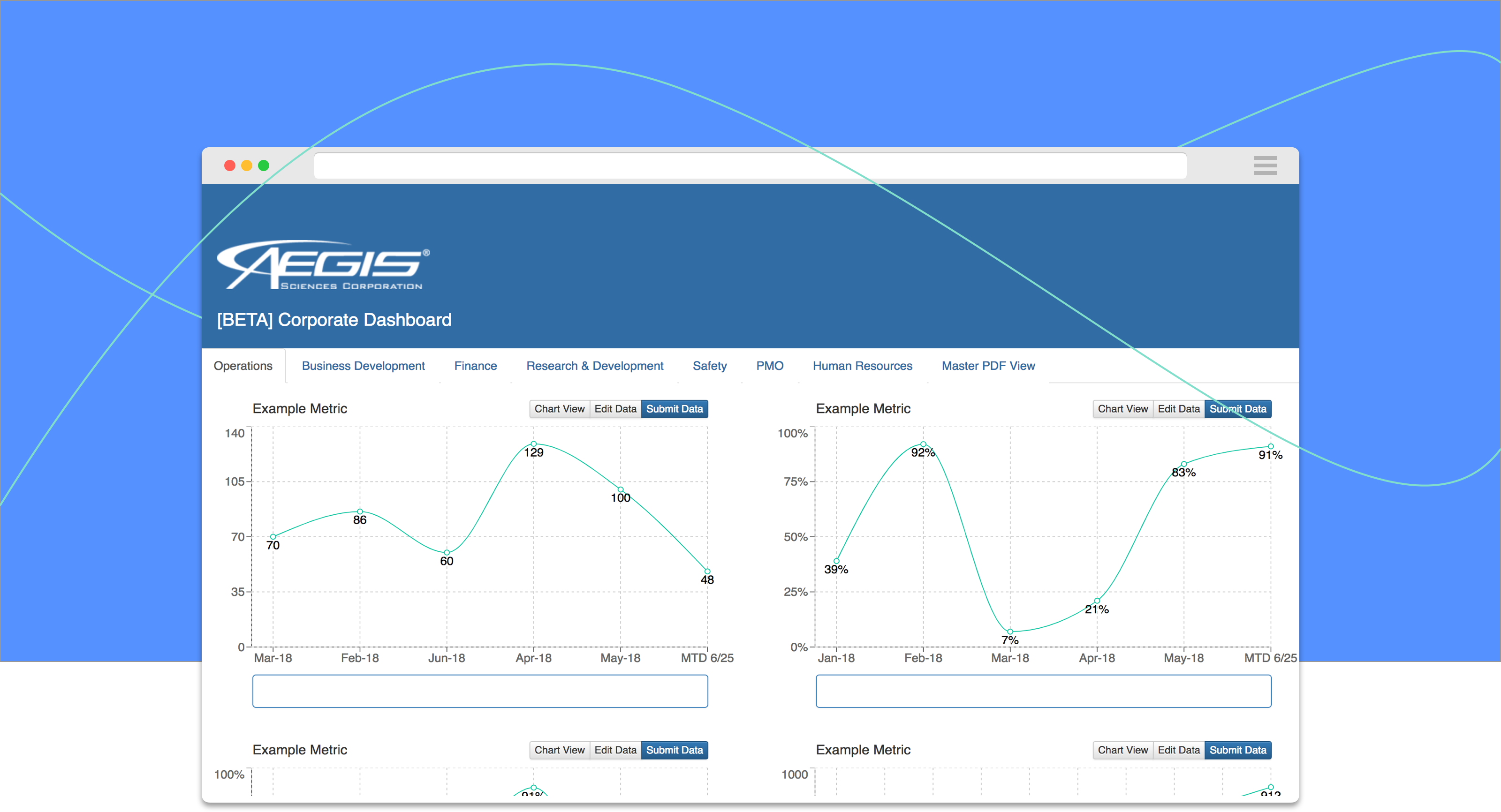
I chose to use a React component style layout to allow for quick rerendering and interactive charts.
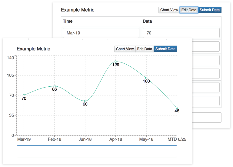
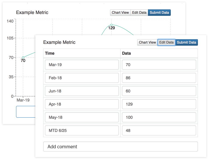
Each component allows simple, intuitive editing at the click of button.
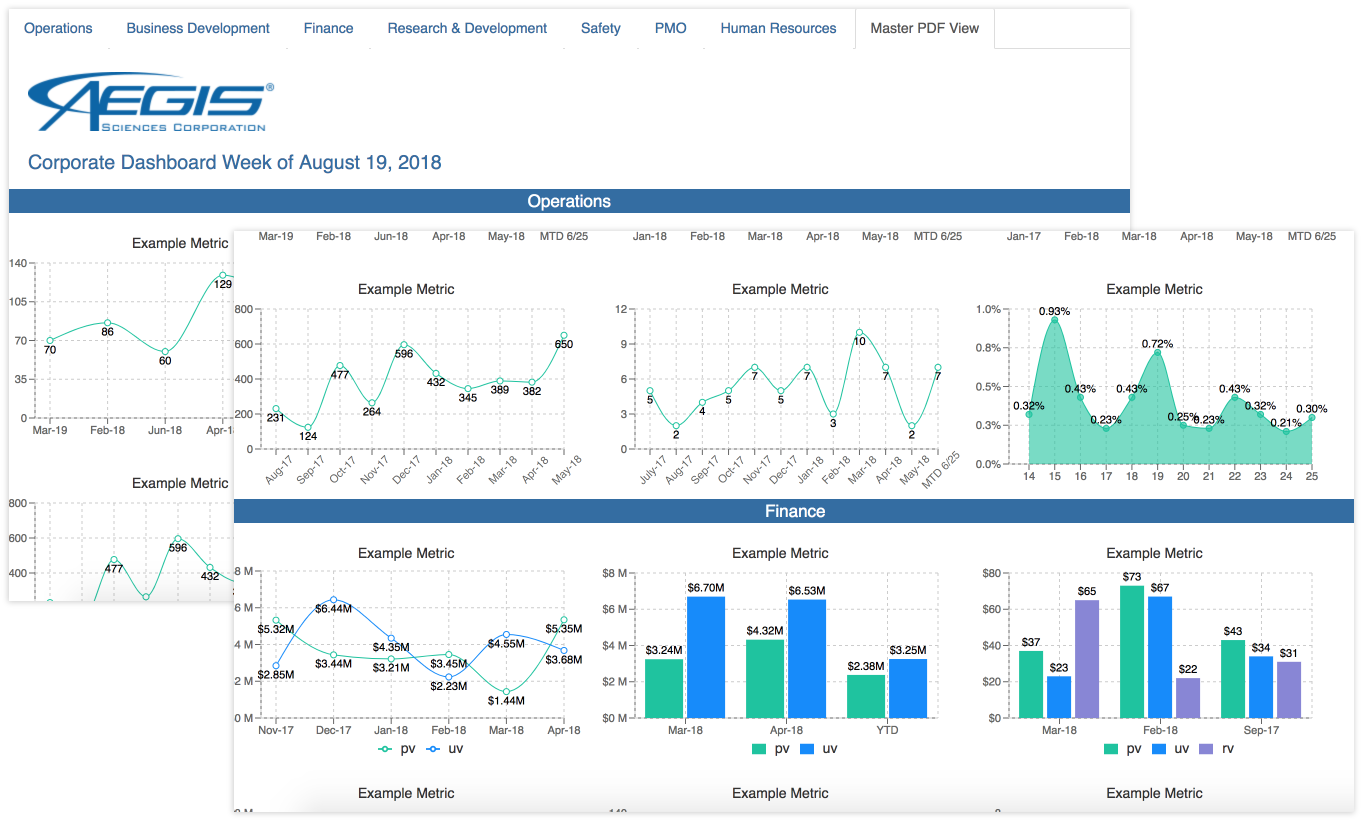
After making her edits, Kenya can now click on "Master PDF View" to see a preview of what the dashboard will look like. She sees everything's in order and can instantly download and print the dashboard.
Generates a live preview of the dashboard.
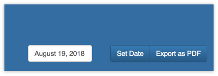
Set the date, export the dashboard, and print.
Through my usability and beta testing, I had Kenya and several other collegues preform tasks while recording their feedback. I preformed think-aloud testing as well to draw out their thoughts and feelings while using the prototype. I tried to record some quantitative data as well through administering a System Usability Scale questionnaire to my participants.
Obviously no system is perfect, that's why it's our job to flush out the issues. I found through my evaluation that many users expected the submit data button to flip the editing side of the component back over to the graph rather than selecting "Chart View". I was able to code up a quick fix in React and my colleagues were much happier.
Although this was just a side project I built during the second half of the internship, many teams were interested in integrating the application into their workflows. I had the really cool experience of being able to present my project to Aegis's CEO and leadership teams. You can find my presentation here.
Since several teams wanted to see the application completed, a lot of my time was devoted to the actual development of my design. However, design is never finished and there are several stylistic and functional changes I began implementing and testing once I finished the beta version. Although the original design was to help Kenya create a specific type of dashboard, with new teams looking to use the application I began experimenting with a feature to allow users to add and delete their own custom charts.
Make your ideas heard:
What started out as a small project to help make Kenya's day easier, expanded in scope to affect multiple divisions and teams.
The user is always number one:
I constanty met with Kenya to get her thoughts, input, and concerns during every stage of contextual inquiry, design, prototyping, implemention, and testing. By working with her so closely I was able to build a functional and intuitive application that many people were interested in using.
The complex solution is not always the best:
When researching the problem, I took a look at several existing applications such as Tableau and Microsoft's Power BI. While incredibly useful tools, they were overkill for Kenya's simple but tedious task. I decided to keep the dashboard very basic and only include the necessary functionality (I like to think of it as a healthy step up from Excel).
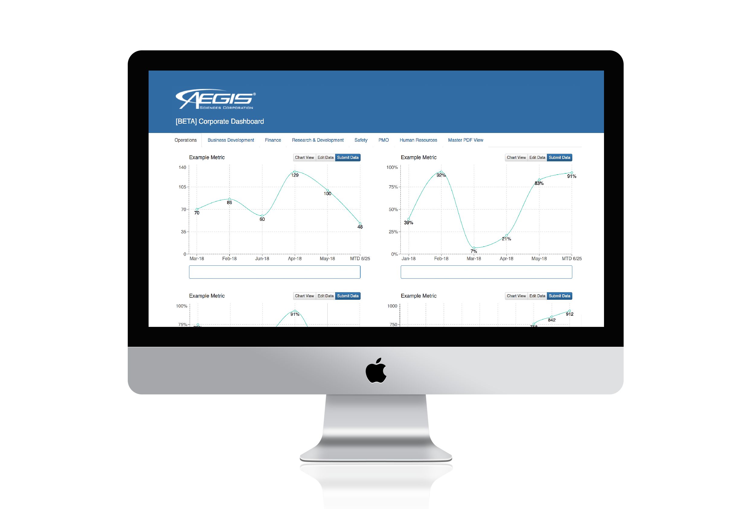
All the screenshots above are from the beta version rather than prototypes. I built this application using ReactJS and Google Firebase. React's component based architecture and virtual DOM allowed me to acheive faster rendering, create chart components easily, and ensured stable code. Check out my repo here.