All it takes is three letters to strike fear into any U.Va students heart. SIS or Student Information System is basically U.Va's system of record for all student-related information, such as admissions, class enrollment, unofficial transcripts and grades, and student finance. Sounds like a useful tool right? Unfortunately, the user interface and layout is absolutely dreadful and causes plenty of headaches every semester come class sign up time. This year, three of my friends and I decided to design a new student scheduler to help out our fellow classmates.
Luis de la Espriella: An all around cool guy from Panama; he's going to be focused on design & prototyping.
Catherine Im: AKA the "mom"; she was basically our product manager and kept us all together.
Megumi Ritchie: Neuroscience major, focused on reading our users minds AKA lead researcher.
Me: I focused on design and prototyping along with Luis.
As students/users ourselves, we really felt connected to this issue and were aware that many improvements can be made to the current system. From our personal experience and upon observing complaints online (too many to count), we found that many students feel the Student Information System (SIS) is very difficult to navigate. This causes many of them to lean toward using theCourseForum, another UVA scheduling tool, when scheduling classes. However, neither SIS nor theCourseForum offer students all of the tools they need to effectively create their class schedules for the semester.
We envisioned that our product would provide a user-friendly interface that consolidates all the tools students need to build their schedules. For each class the system will display student-sourced data about the rating of the class, time spent outside of lectures, and rating of the professor. In addition, the product will provide a visual representation of their daily route using the location of their classes to make sure they have enough time to get from their desired class to the next. Our goal was to bring together utilities that, at the moment, are separate from each other, and bring new ideas to the table that will make the user experience more satisfying.
Armed with our original concept statement, we set about the contextual inquiry and analysis stages to see what we needed to change based on feedback from our client and users.
For the contextual inquiry stage, we met to discuss the key players in our project. We thought about who was involved with scheduling classes at UVA. We talked about the work roles within scheduling, like the sysadmins for SIS and the people responsible for updating class information, as well as the students who are the users of whichever scheduling platforms they choose to use. We decided to interview the potential users for our system, UVA students. Initially, we each wanted to interview two students, but we ended up with a total of eleven student interviewees. Before we began the interviewing process, we decided on the questions we would ask, as well as reminding ourselves that the questions weren't a strict guideline to follow. We each went into the interviews with a set of questions, but prepared to ask followup questions for any interesting answers that an interviewee might give. The questions were as follows:
What tasks do you use SIS for?
Do you use SIS for scheduling classes from start to finish?
If yes, why do you use SIS over other products?
If no, why do you use the other product(s) over SIS?
What do you like or dislike about the product(s) you use?
We realized that a lot of students brought up similar things, and we saw recurring themes in the answers of the students. Most students used SIS for intended purposes like finances, transcripts, and academic requirements, but a majority of them did not exclusively use SIS for scheduling. Several other scheduling products were brought up during interviews, such as theCourseForum, uvaschedule.me, coursicle, and Lou's List. During the interview, most interviewees seemed to have generally negative emotions toward SIS, calling it "awful" and saying it needed "a complete overhaul." We also got responses like "it sucks" and "it crashes all the time," leading us to believe that most students probably associate SIS with an inadequate, visually unappealing, and user-unfriendly system. Upon observing the students interact with SIS, we found that while many were able to successfully navigate through scheduling features of the site, they were unsure of what all of the features did and some even needed to google how to add/drop/swap classes. However, our data could admittedly be skewed due to the fact that most of the users we observed have already had years of experience with SIS. In addition, many users expressed verbal complaints, such as noting its confusing layout, as they navigated through SIS.
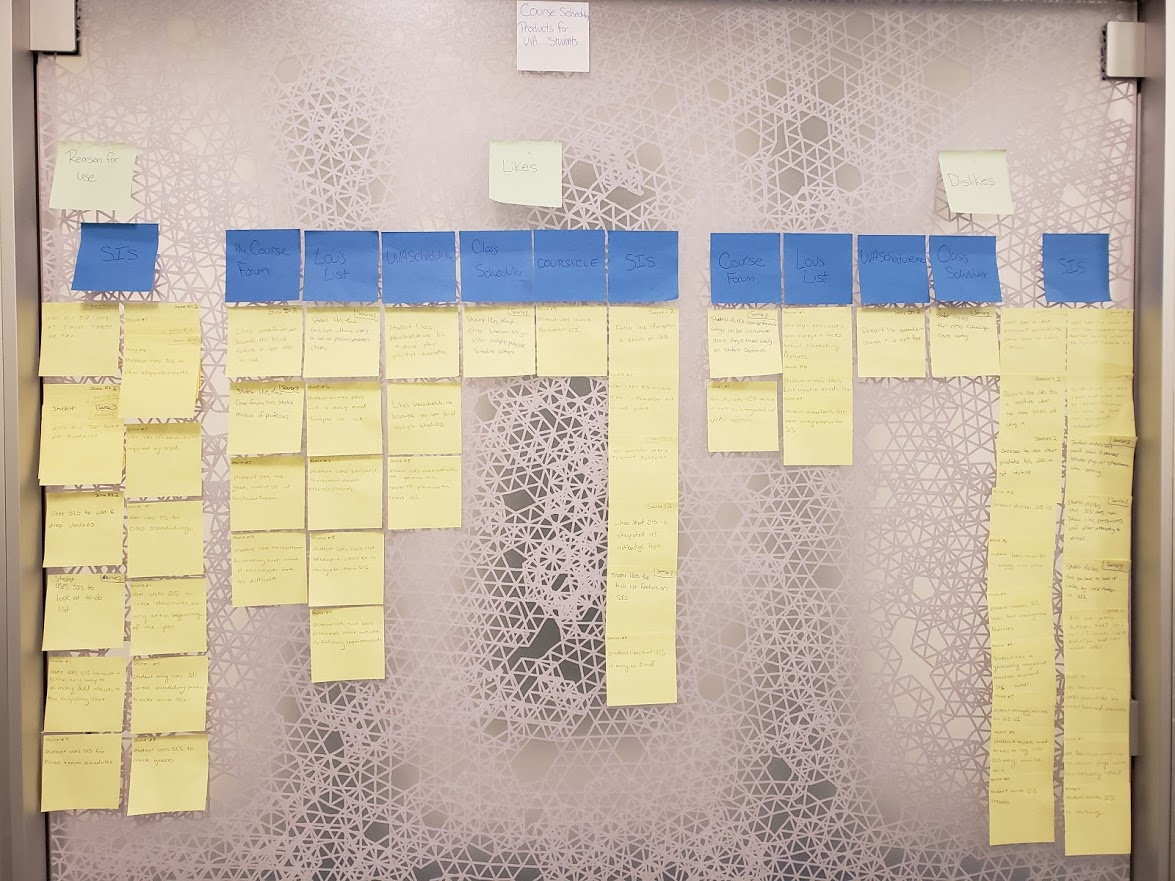
Each of us tried to contribute to the discussion for each cluster as it formed, but eventually, the recurring themes became evident, and we finished up clustering our notes with less and less discussion. Once we were out of notes, we took a step back to look at the clusters that had formed. We then discussed the similarities and connecting threads for each section and tried to label these groups. Once we were satisfied with the lowest group labels, we then tried to group the groups into the next logical hierarchical group. We kept grouping them until we decided it would be no longer useful to have more levels. At this point, we labeled the whole WAAD under "Course Scheduling Products for UVA Students." By building the WAAD, we gained a visual representation of what we had originally hypothesized: the students that we interviewed had a lot of negative things to say about SIS, as this group ended up being the largest of the dislikes.
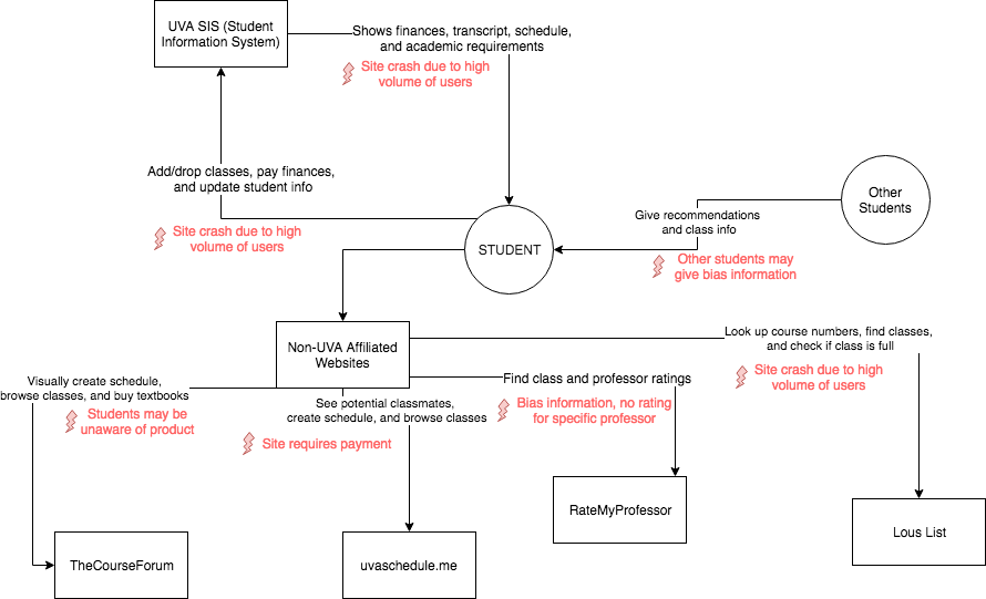
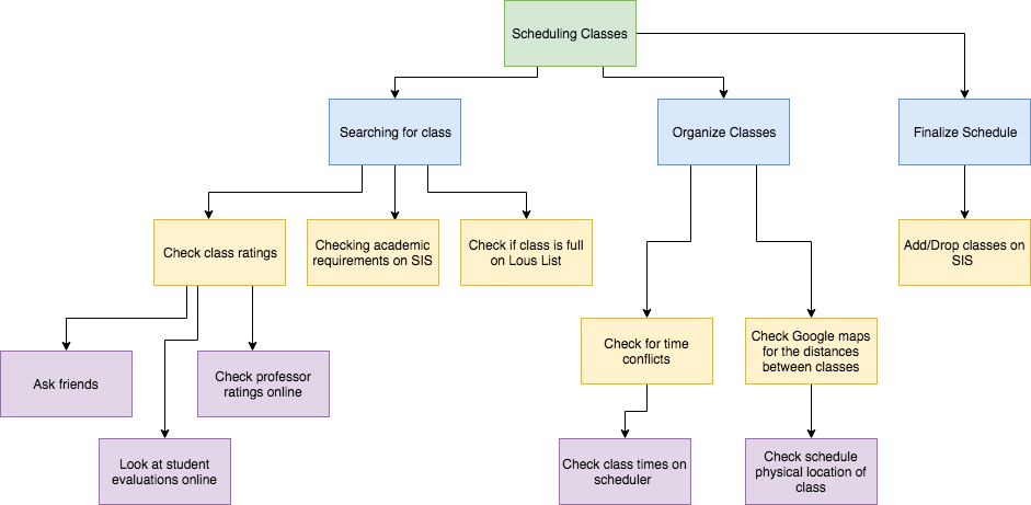
When creating our DIMs, we discussed the types of models we could have used. In the end, we decided to stick to the flow and task models, because we felt that other models we had learned out wouldn't give us relevant information, or that they would be redundant with what we could see with these two models. For example, a user model wouldn't yield interesting data—the user roles involved are limited, and interactions between user roles are strictly regulated by tight flows of information. For example, a student looking for a class's availability would see that the class was open, waitlisted, or closed, based on information populated on SIS. Most of the interaction here is short and specific, and our current and envisioned systems would not change much.
With our research and models in mind, we created several requirements to guide our initial design.
Searching for Classes:
The user will be able to search for courses based on the department, name, or subject matter. User shall be able to scroll through all available classes for any particular subject.
Viewable weekly schedule:
Calendar feature shall show the user’s weekly course schedule using blocks to represent time. Student will be able to create and view multiple tentative schedules.
View distances between classes:
Students shall be able to see the physical distance between classes, as well as the time it takes to get from one class to another. System will have an embedded gps mapping app to calculate and report these distances.
Simplicity:
Our system will have an uncluttered home page featuring one menu that will guide students to view courses or schedules. Menus will directly correspond with actions/results. No unnecessary steps. Shall have an intuitive menu dedicated to add/drop from which users can easily add or drop classes.
Bailey Harper is a current third-year student at UVA double majoring in CS and art. When he schedules his classes, he has to schedule classes that fit requirements for both his CS and art majors. He usually uses Lou's List to find classes that fit into each of these majors. Often times, he finds that he has to choose classes based on their location, since CS classes are generally located far from any of the art class locations, and he can't walk between them in the ten or fifteen minutes he is given. In order to check these distances, he uses Google Maps to look up how long it would take to walk from his first class to the next. He's knowledgeable about SIS and uses it to add potential classes to his shopping cart, to create a potential schedule, and to finalize his course choices. He wishes there were a less tedious way to create these potential schedules than to have to manually select and deselect classes.
Bailey is dreading working on his schedule for the next semester. Because his classes are often far apart from each other, he often spends hours trying to find classes that he can make in time and that pertain to his major. In the past, he used a combination of SIS, Lou’s List, and Google Maps to search for and enroll in classes, so he is worried and stressed about how time-consuming his scheduling could be. Bailey heard about SchedulEz from a friend in class and decides to try to use SchedulEz instead of his usual scheduling methods. Bailey logs on to schedulEz through netbadge, and was surprised and relieved to find that the website was highly intuitive and similar to the systems that he was accustomed to, just all in one convenient location. He clicks on the class search tool, and is able to easily view classes that fulfill his academic requirements. He then clicks on the map view tool, and was happy to find that he could view the walking times between his classes. He notices that one of his planned classes is marked with an alert telling him that his walk time exceeded the allotted time between classes, and makes a mental note to change that class. Bailey continues this process for each of his classes, and clicks the schedule view tab to view his finalized schedule.
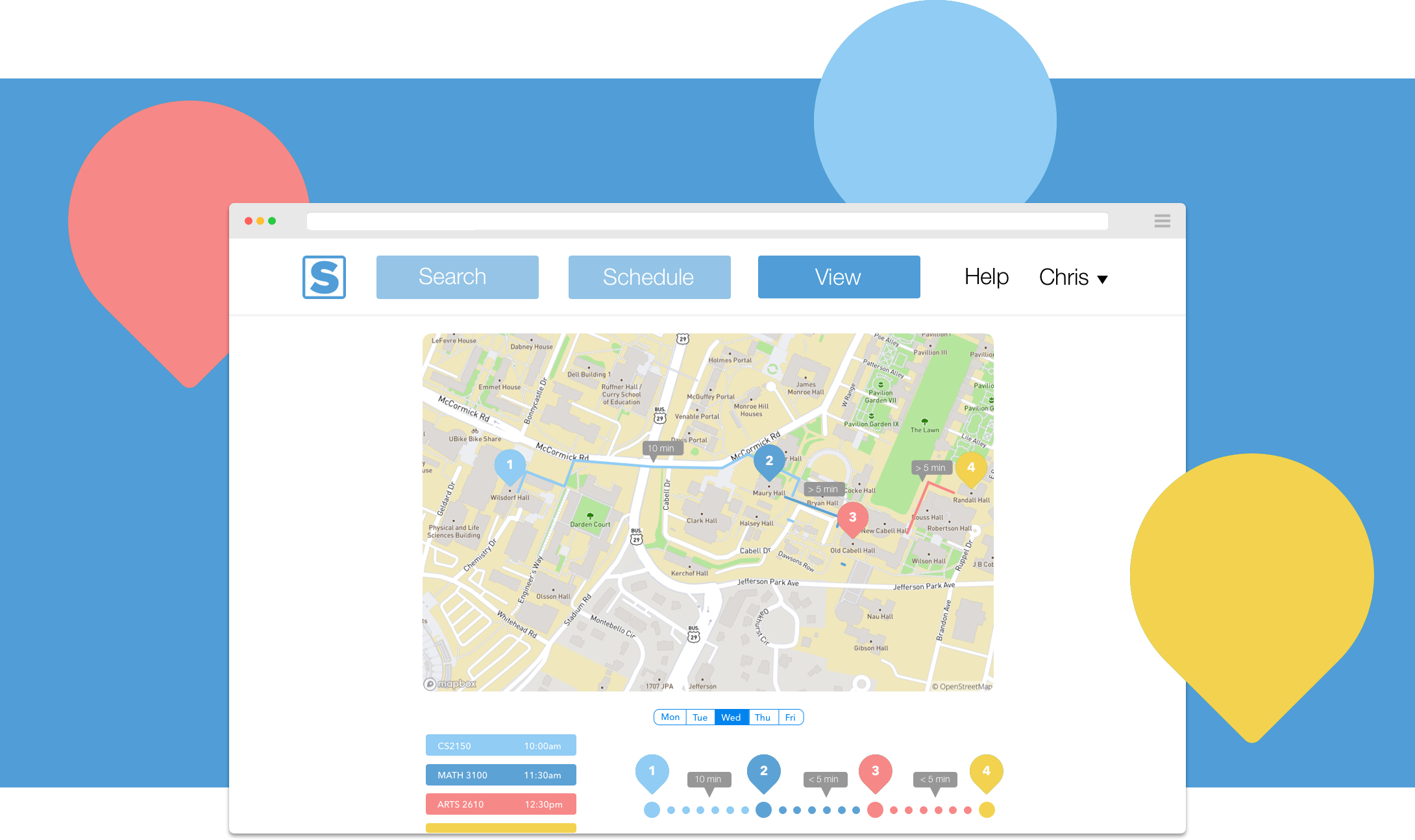
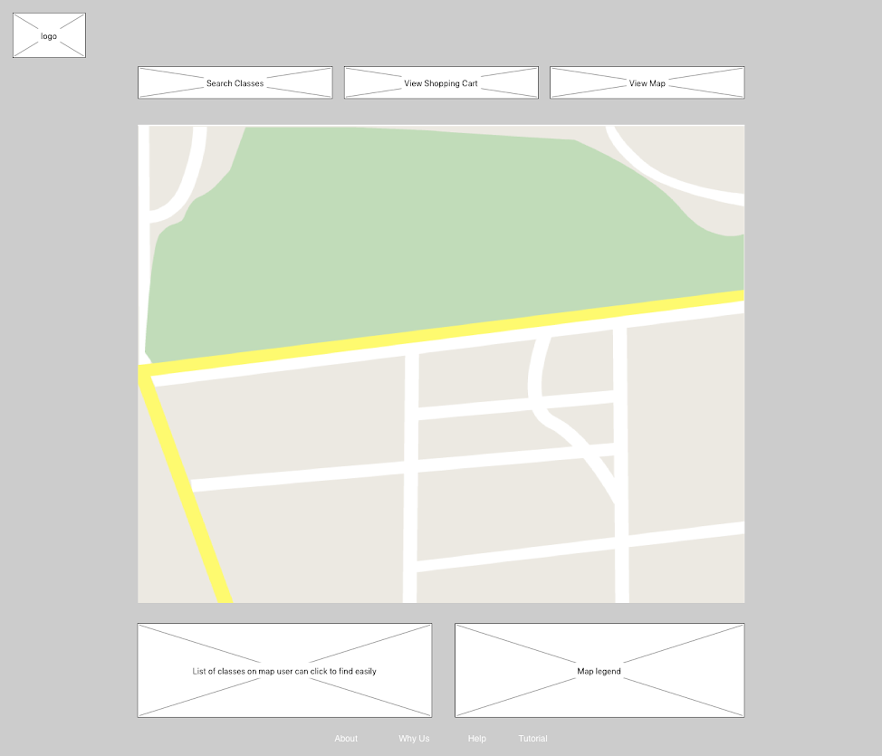
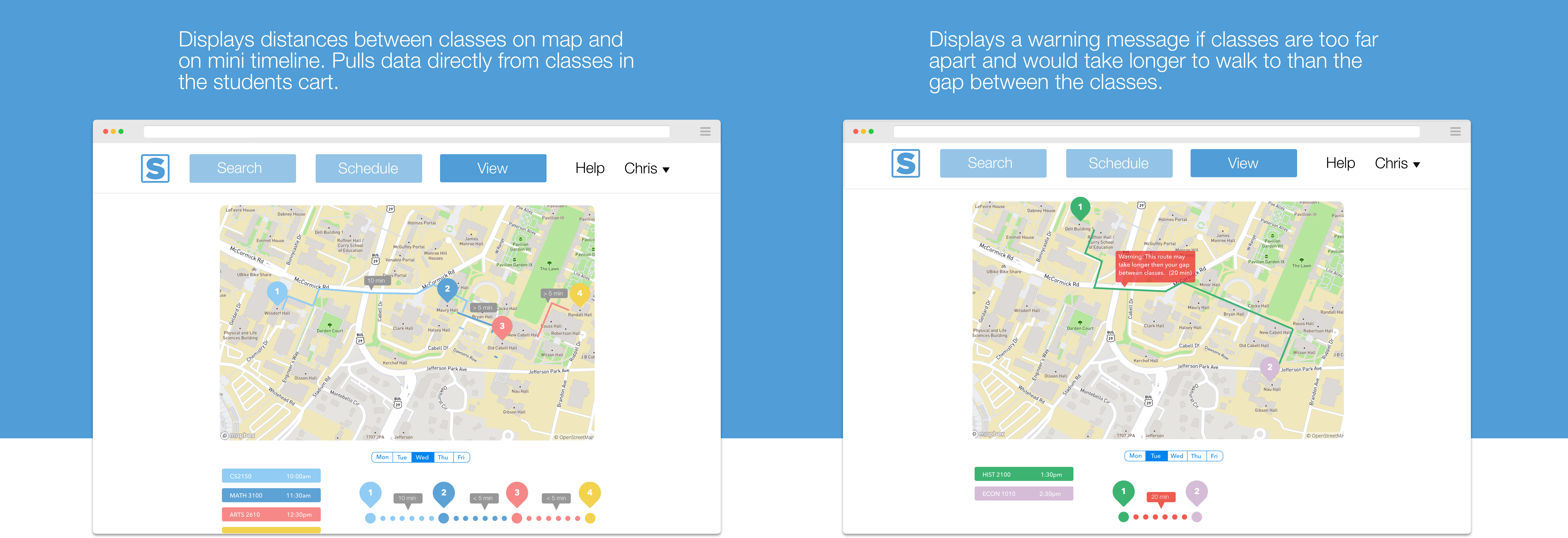
The map is really the standout feature of our scheduler as no other scheduling application we found has a similar feature. Users can see distances between classes similar to Google Maps and a legend below the map identifies each class location.
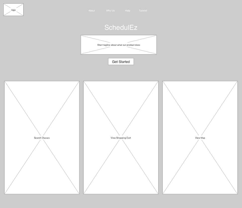
The original wireframe for our landing page. Shows each scheduling feature prominently and a "get started" button to take users to a sign up page and through a short tutorial.
Because our system was designed to include multiple, modular sections that work in collaboration to ease the scheduling process, we initially planned to create a horizontal prototype. We felt that this would properly showcase the interaction between each of the elements. However, we received a lot of positive feedback on the map portion. Many students were particularly interested in the map feature as they had not encountered a dedicated, embedded map for their scheduling needs. We decided that it was a strong enough reason to show how this portion of the system would work in more detail, and that fleshing out the feature that users reacted to most strongly would help us glean better data during our evaluation phase. We therefore built a "T" prototype, which highlights our map module without sacrificing the overall selling point and unique offering of our system—the fact that we consolidate the various resources that should interact to provide a start-to-finish scheduling experience for any UVA student.
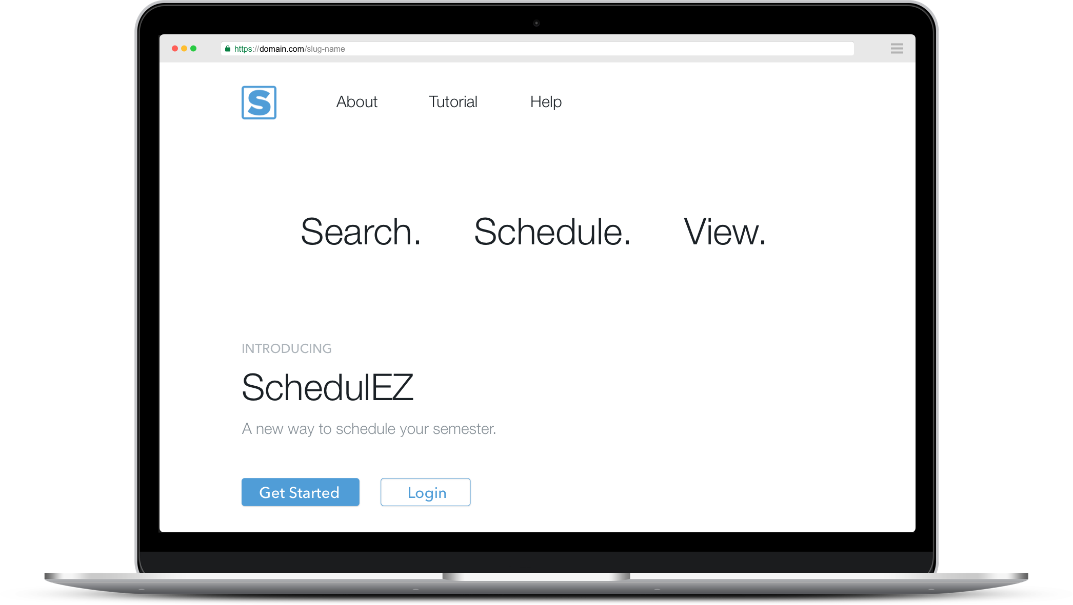
Quickly allows users to login or create a new account and provides links to information about the product.
Onboards users into the scheduler.
Allows users to search by keyword or by department where they can browse a list of classes.
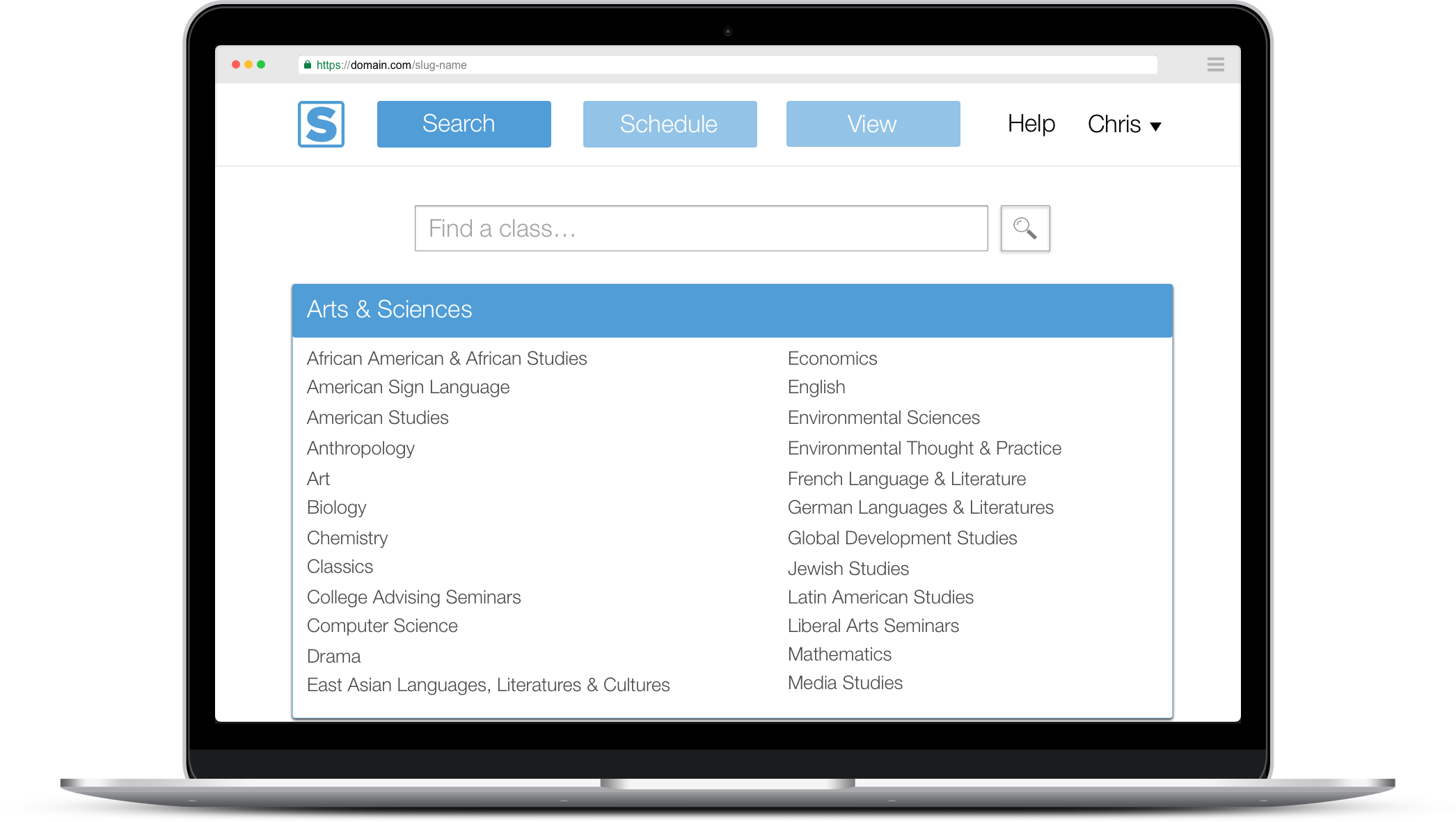
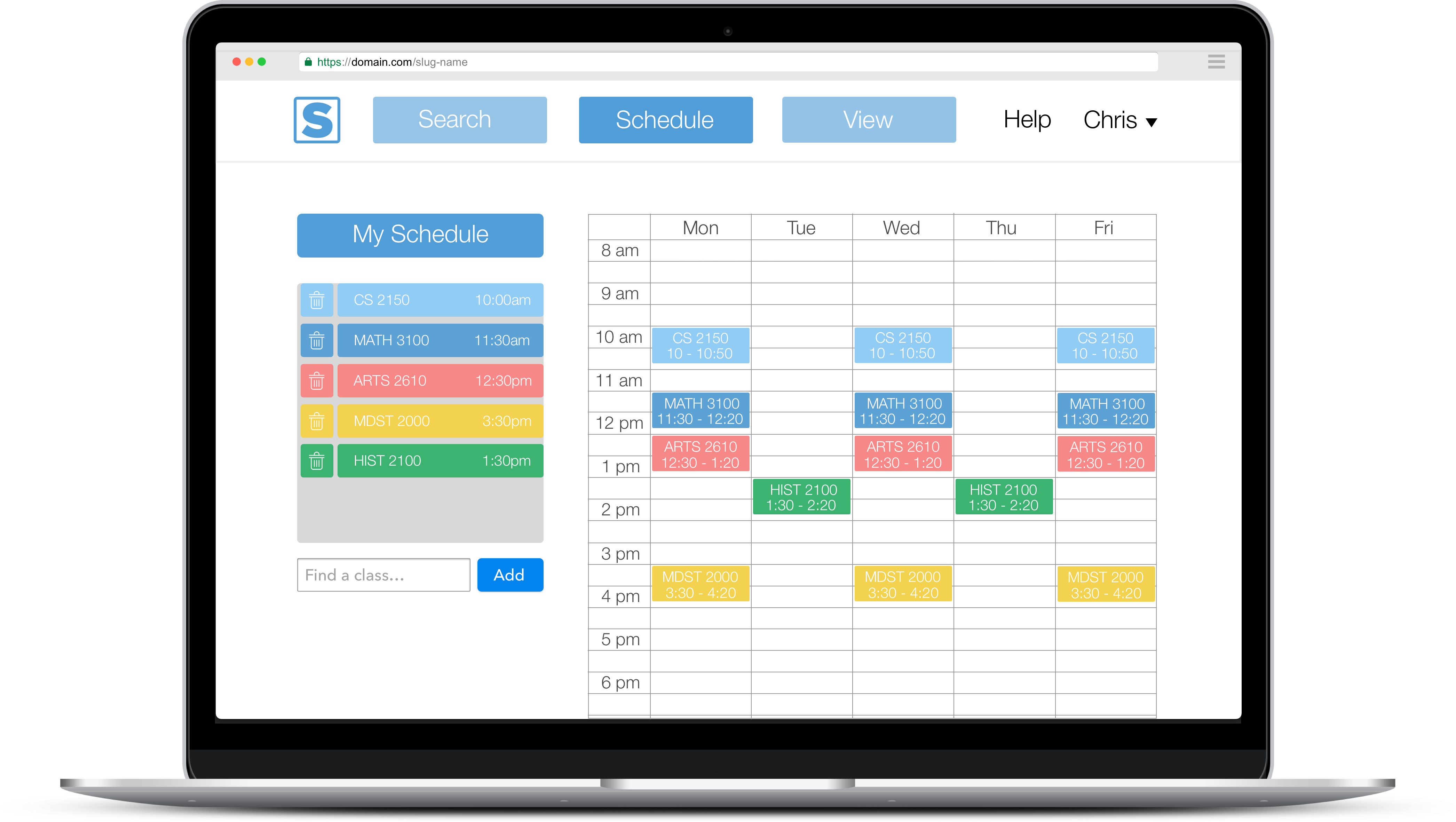
We tried to keep the scheduler simple and intuitive. Users can add classes by using the search page or searching directly from the scheduler page. Displays the tentative schedule on a weekly calender type layout.
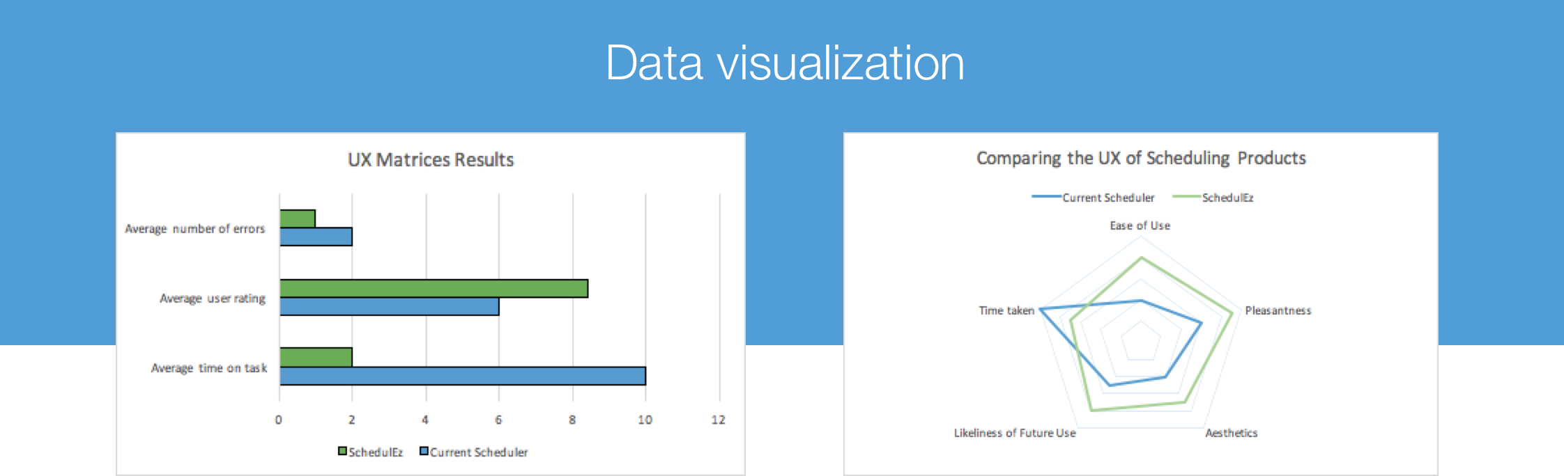
We designed our evaluation around how well we achieved our initial goal, which was to create a scheduling system that was easy to learn and use, time efficient, and more pleasant to use than the current system. Based on these three main goals, we came up with our metrics. To measure the ease of learning and use, we decided to look at the average number of user errors, as fewer errors would imply the system had met our goal. For time efficiency, the clear metric to use was the average time spent on a given task. We wanted users to be faster on the new system than on the existing system. The final metric for our final goal was to generate an average user rating on the scheduling experience.
Each of our benchmark tasks involve viewing different parts of a class schedule, as that is one of the ultimate goals of a scheduler. For each of these, we obtained results by timing the user and documenting the errors that occurred. To test the initial difficulty of learning the system, we asked the users to view one class. To test the difficulty of use overall and the ease of navigating between each part of the system, we asked users to view the map, class, and schedule. While ideally we would have also tested the process of enrolling in classes, the mid-fidelity nature of our prototype would have not yielded accurate results, so we decided to look specifically at viewing courses and schedules.
In addition to the benchmark tasks dealing with objective data on our metrics, we included a questionnaire to gather subjective data on the metric dealing with the average user rating for the experience. This questionnaire was made based on the feedback that we had gotten from our previous project phases, the feedback from our design studio (i.e. the things that our potential users liked and disliked about existing schedulers), and our UX requirements and goals. To make the questionnaire easy to complete and evaluate, we chose a 1-10 scale that ranged from a negative experience to a positive experience in each of six areas of interest. We also included at the end a comment box for any additional feedback that a user might have that didn't fit into any of the existing questions.
About 10 users interacted with our prototype by performing the benchmark tasks listed above, then were given a quick survey about their experience. For the benchmark tasks, the users were evaluated through timing and error rates. Most users took less than 3 minutes to complete every task, which is much less than the average 10 minutes it would take using the current available systems. In addition, there were almost no errors or confusion about how to use the system (as students are generally used to these types of systems). We noticed that users were surprised by the simplicity of the scheduler and many users reported that they enjoyed how each part was easily accessible and learnable. We did receive some feedback suggesting that we show specific academic requirements. The map portion, which was the most high fidelity, was generally well received, but there was a comment on the questionnaire that suggested we include the physical location of the user on the map.
Class requirements:
An important improvement for the design which our users believed would be beneficiary is having the list of requirements for that specific person. In other words as CS major for example, the list would show all the requirements such as CS elective, Math electives and more. They would show up to show the course number, the description and which classes are available for the semester the user is searching for. This way when the student chooses their class they would instantly know if that class would satisfy a requirement they are trying to fulfill.
Current location:
An improvement for the map would be having your current location as well as your housing location. This way google maps not only tells you how far your classes are between each other but also how far (time consuming and distance) your housing is to your next class as well as your current location to the next class.
Bus lines:
Another improvement that can be enabled for the map would be to have the bus line you use the most show up. This way you can decide to travel on bus to your next class, take a car, walk, bike or else. This of course has to include the previous improvement so the map knows your location and can show all the most efficient ways to get to your next class.
It was an incredibly fun experience to be able to work with some of my good friends to design something that would impact not just our fellow students, but us as well. If there was one thing I really took away from this project would be to trust the process. Being users ourselves, it would be easy to think that our own experiences and thoughts would be valid indicators to guide our design. However, conducting in-depth research and extracting design requirements based on our fellow students feedback allowed us to build a much more useful and intuitive experience. One aspect I really want to revisit is the overall aesthetic and cohesiveness of the design as I feel it has alot of room for improvement from the very basic prototype we have right now. In addition, we've been considering designing a mobile version and are conducting research to determine if any students build their schedules on their phones rather than a laptop.